Colour Psychology
Colour psychology is the study of how colours influence our behaviour and emotions. We are surrounded by colours every day, from the clothes we wear to the colours of our walls.
Studies have shown that colours can have an impact on our mood, behaviour, and even our decision-making. When it comes to choosing a colour for a product or environment, it’s important to consider how the colours may affect people’s emotions and behaviour.
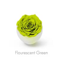
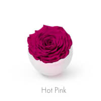
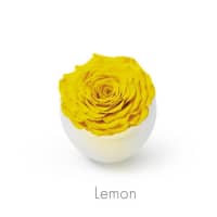
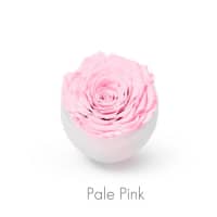
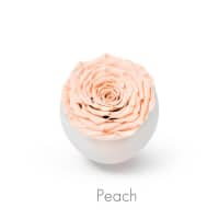
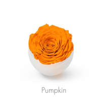
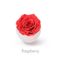
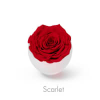
Different colours can evoke different responses from people, so it’s important to consider how a certain colour may affect the experience of a product or environment. For example, colours like red, yellow, and orange are associated with energy, excitement, and joy. They can be used to draw attention and evoke feelings of enthusiasm and happiness.
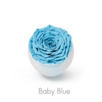
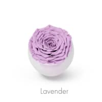
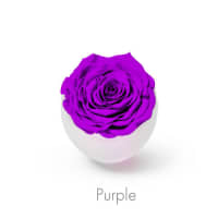
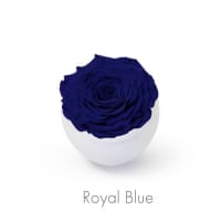
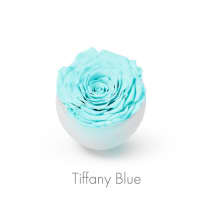
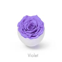
On the other hand, colours like blue, green, and purple are associated with calmness, relaxation, and contemplation. They are often used to create a sense of peace and serenity.
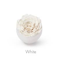
Colours may also be interpreted differently by different cultures. For example, in Western cultures, white is often associated with purity and innocence, while in Eastern cultures it may be associated with death and mourning.
The Use of Colour
In the world of design, colour is an incredibly important element that can be used to evoke certain emotions, create different atmospheres, and create a sense of balance and harmony. It can be used to create a mood, draw attention to a particular area, or simply to make a design more visually appealing. When used correctly, colour can be a powerful tool to grab the attention of viewers and to create a desired effect. Colour can be used in a variety of ways, from the traditional primary and secondary colours to the more modern, vibrant shades and hues.
When it comes to using colour in design, it is important to take the purpose of the design into consideration. If the goal is to create a calming atmosphere, then using softer, muted colours may be the best approach. On the other hand, if the goal is to create an attention-grabbing, energetic design, then brighter, bolder colours are a better choice.
Another important factor when working with colour in design is to consider how the colours interact with one another. Some colours can produce an energising effect when used together, such as red and yellow, while other colour combinations can create a calming effect, such as blue and green. It is important to choose colours that work well together to create the desired effect.
 |
 |
 |
 |
 |
 |
 |
 |
 |
 |
 |
 |
 |
 |
 |
 |
 |
 |
 |
 |
 |
 |
 |
 |


